Qualys ETM Enhancements Part 2 – Upgraded, Enhanced UI for Faster Risk Decisions

Table of Contents
- The Design Problem ETM had to Solve
- 1. Calm by Default, Urgent by Exception
- 2. Visual Hierarchy that Respects How Humans Scan
- 3. Color Language that Communicates Trust and Urgency
- 4. Modern Iconography that Reduces Cognitive Load
- 5. Data Visualization that Tells a Story
- 6. Card-based Layout for Modular Clarity that Scales with the Platform
- 7. Typography that Favors Action Over Decoration
- What the Enhanced Interface Means for ETM Users
The hardest part of cybersecurity is not detection — it is decision-making under pressure. A security UI should do one job: help the operator make the right decision in the few seconds they actually have. Not by “how much data is on the screen,” but by how quickly someone can answer the questions that matter at 9:30 AM on a Monday or 2:00 AM during an incident.
That’s the intent behind the enhanced design language for the Qualys ETM UI – clarity, trust, and fast decision-making without turning the platform into a noisy dashboard wall.
The Design Problem ETM had to Solve
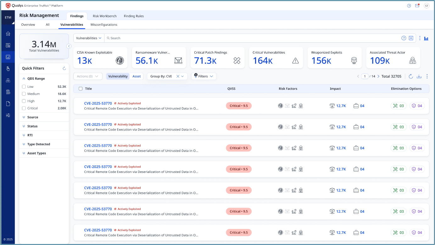
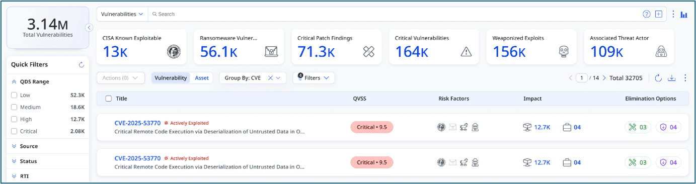
ETM aggregates risk across assets, vulnerabilities, misconfigurations, threats, identities, and controls. That’s a strength — and a UI liability.
When everything matters, the interface must answer four questions instantly:
- What changed?
- What’s urgent?
- Why does it matter?
- What do I do next?
The enhanced ETM user interface is built around these questions. Below is what’s new in the UI experience, and why each change matters in real security workflows.

1. Calm by Default, Urgent by Exception
The first, most noticeable change is restraint: generous white space, fewer hard borders, soft shadows, rounded edges, and subtle dividers so the eye goes straight to what matters.
When ETM is aggregating risk signals across tools and teams, the UI can either:
- amplify cognitive load, or
- reduce it.
The new UI is explicitly aiming for the second: helping users digest complex data without feeling overwhelmed. Security platforms fail when everything looks critical. ETM makes urgency intentional. It’s about lowering baseline cognitive load, so real risk stands out when it appears.
Why it matters: Less visual friction when you’re scanning dashboards, reading a risk view, or moving from one module to another.
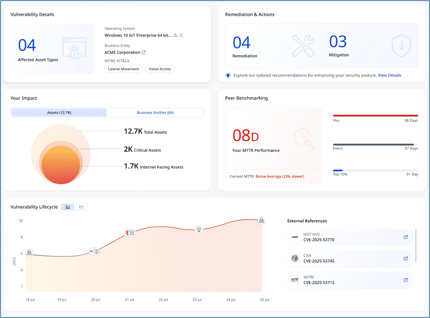
2. Visual Hierarchy that Respects How Humans Scan
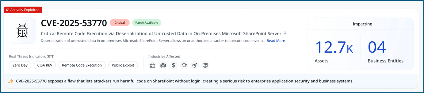
The upgraded ETM UI leans into that reality by making critical KPIs bold, large, and high-contrast – including metrics people use every day like CVSS, asset counts, and MTTR.
Supporting details stay lighter and smaller, so the UI naturally answers:
- “What’s important?”
- “What’s secondary?”
- “What’s context?”
The intended outcome is explicit: fast scanning, immediate prioritization, and high information density without clutter.
Why this matters – ETM’s promise is to help prioritize and remediate risk faster. The UI has to make that prioritization obvious at a glance, not hidden behind clicks. Qualys ETM supports faster identification, smarter prioritization, and faster remediation outcomes.
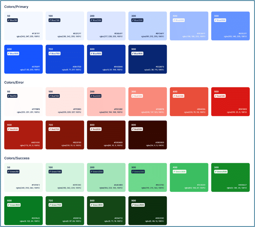
3. Color Language that Communicates Trust and Urgency
The enhanced UI uses a controlled palette:
- Blue as the primary foundation to communicate trust and enterprise reliability.
- Reds and Oranges used deliberately in risk-driven areas to flag urgency—exploits, severity, MTTR at risk, trending threats.
- Accents used sparingly so alerts feel authoritative, not noisy.
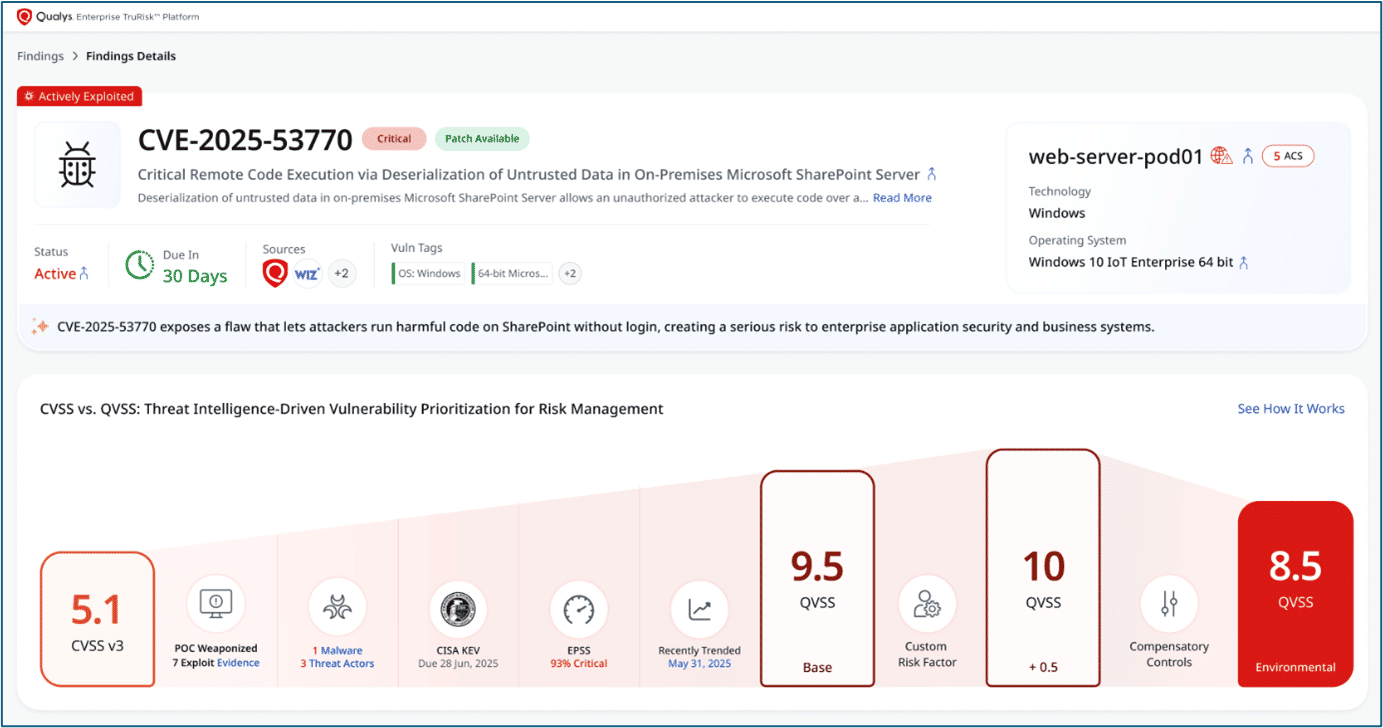
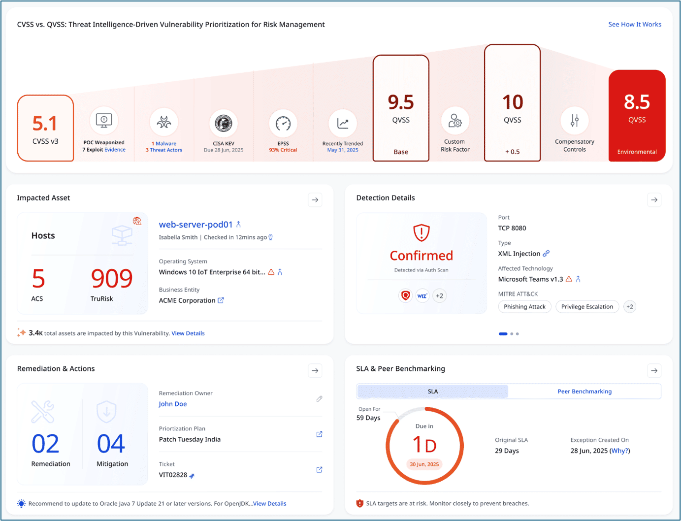
Another important refinement in the enhanced interface is the updated color coding for QDS, QVS, and the TruRisk™ Score for speed of interpretation.
The new UI introduces a consistent color theme with progressive shading, where darker colors always indicate higher risk. Instead of jumping across unrelated hues, the interface uses a unified gradient that makes severity immediately obvious:
- Low – lighter, muted tones
- Medium – deeper, warmer tones
- High – strong red
- Critical – darkest red / maroon
The new scheme ensures that:
- Urgency is visually consistent across QDS, QVS, and TruRisk™ Score.
- Critical items stand out instantly in lists, meters, and charts.
- Cognitive friction is reduced, as operators do not need to relearn what colors mean on different pages.
Why this matters: The UI stays calm, but when something needs attention, you will notice. In a Risk Operations Center, color is a prioritization cue. The scoring logic remains the same, but risk is now easier to see, rank, and act on—especially when decisions need to be made fast.
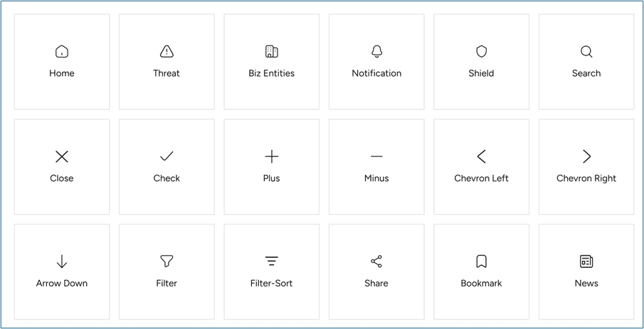
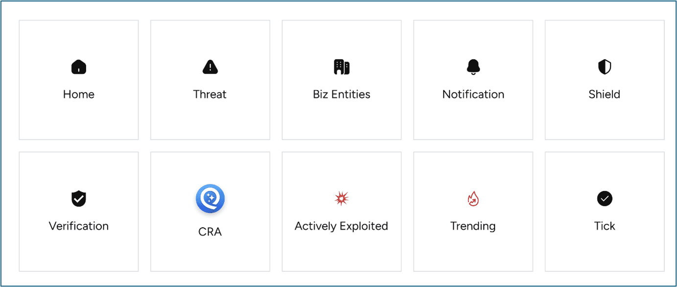
4. Modern Iconography that Reduces Cognitive Load
Icons are a compression format in ETM. The upgraded UI standardizes on outlined, geometric icons with consistent stroke weights to reflect precision and engineering discipline.
Why this matters: Users can recognize common actions and meanings before reading a label, which matters when triaging findings or moving quickly through lists.
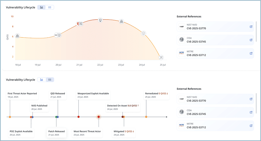
5. Data Visualization that Tells a Story
Dashboards should answer: what changed, when, and why?
The enhanced UI highlights this directly with line charts and gauges that emphasize progression, using smooth curves and soft gradients to avoid chaotic visuals. And importantly, tooltip-style markers help connect peaks and dips to real events.
Why it matters: It is the difference between “risk went up” and “risk went up because this threat trend spiked / this control drifted / this exposure surfaced.” ETM’s job is risk operations, and risk requires narrative, not just numbers.
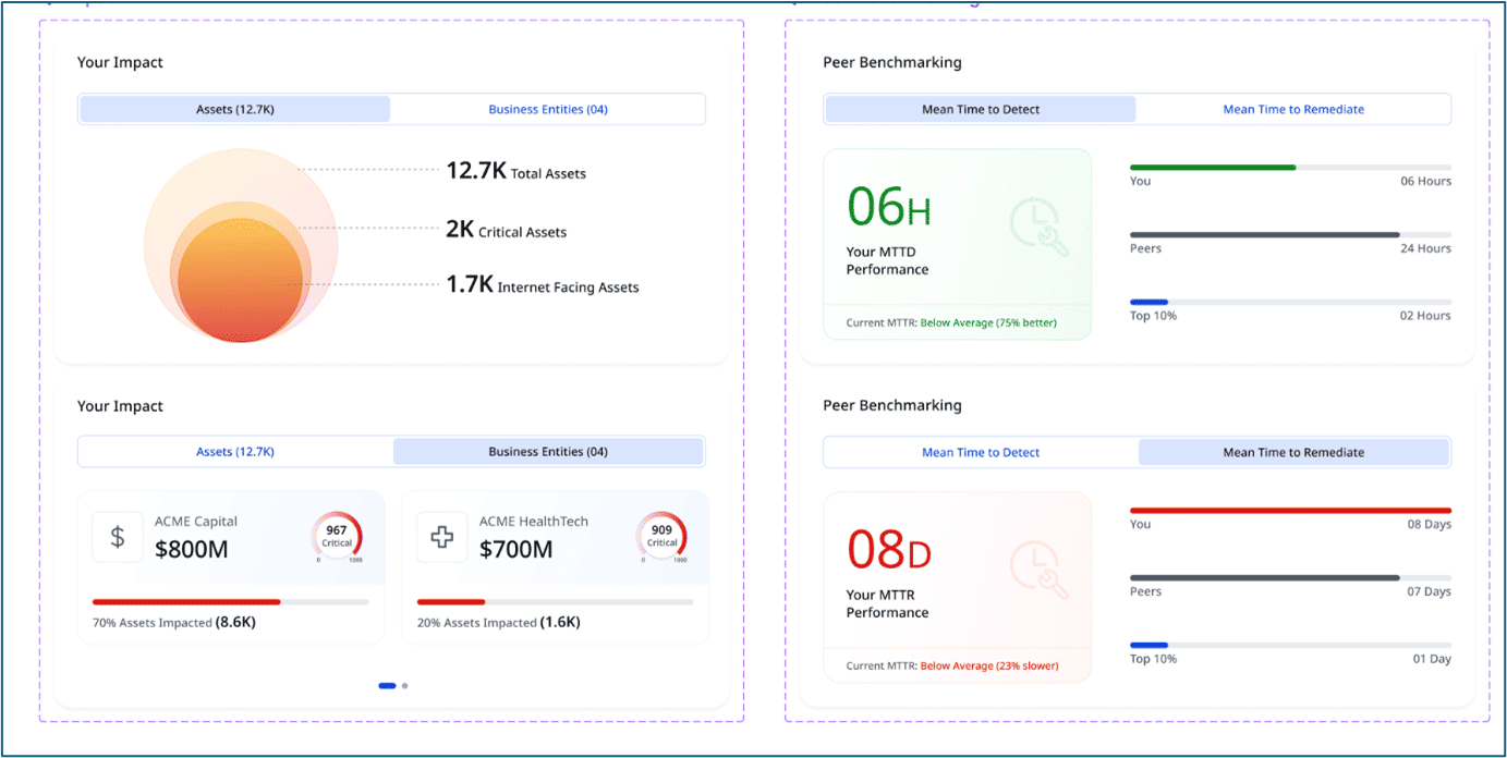
6. Card-based Layout for Modular Clarity that Scales with the Platform
ETM is expanding – more risk dimensions, more workflows, more integrated capabilities. A fixed, monolithic UI breaks under that weight.
The new interface adopts a card-based layout, where each section is a self-contained “unit” with soft shadows and rounded edges.
This does two things:
- Makes the interface easier to parse, as the brain naturally “chunks” information.
- Keeps the UI future-proof, allowing new metrics and modules to be added without redesigning the entire page.
It also aligns with how Qualys dashboards are used in practice: configurable widgets and multiple dashboards tailored to teams or functions.
7. Typography that Favors Action Over Decoration
The UI’s typography is intentionally blunt:
- Bold headers for importance and urgency
- Neutral body text for quick reading
- Oversized numeric values because in cybersecurity, numbers drive decisions
This is a subtle but major upgrade for ETM users. When presenting risk to leadership, numbers should “carry” visually without requiring explanation.
Why it matters: Qualys has been openly investing in platform UI modernization (for example, the Enhanced UI 4.0 rollout described as making the journey “faster, smoother, and more immersive”).
What the Enhanced Interface Means for ETM Users
The upgrade builds on that direction and applies it to what ETM needs most: a risk-centric interface that stays readable under pressure.
- If you’re a CISO or risk owner: The UI is designed to make risk posture easier to communicate, with a cleaner hierarchy, stronger KPIs, and clearer “why it matters.”
- If you’re an operational security leader: It is built for triage speed, less clutter, controlled urgency, charts that connect to events, and modular cards that are easy to scan.
- If you’re the person who lives in the tool: It is designed to feel consistent and predictable, with icons, typography, and layout patterns that remain stable across contexts.
The enhanced design language communicates exactly what ETM is meant to deliver:
- Young and modern without being playful
- Robust and trustworthy without being heavy
- Calm but alert without being noisy
- Insight-focused without burying the lead
In risk operations, the UI is part of the control surface. And the new UI is clearly designed to help teams see risk faster, agree on priorities faster, and demonstrate reduction faster.